***Please note: This brand was created for university assessment purposes only. This is not a real brand***
Palmed Off - Brand Style Guide
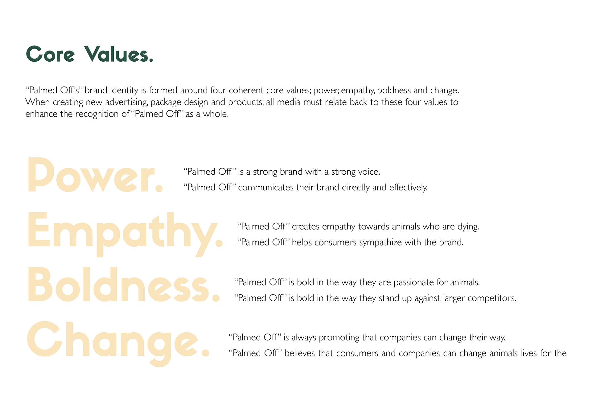
Introduction and Brand Intent.
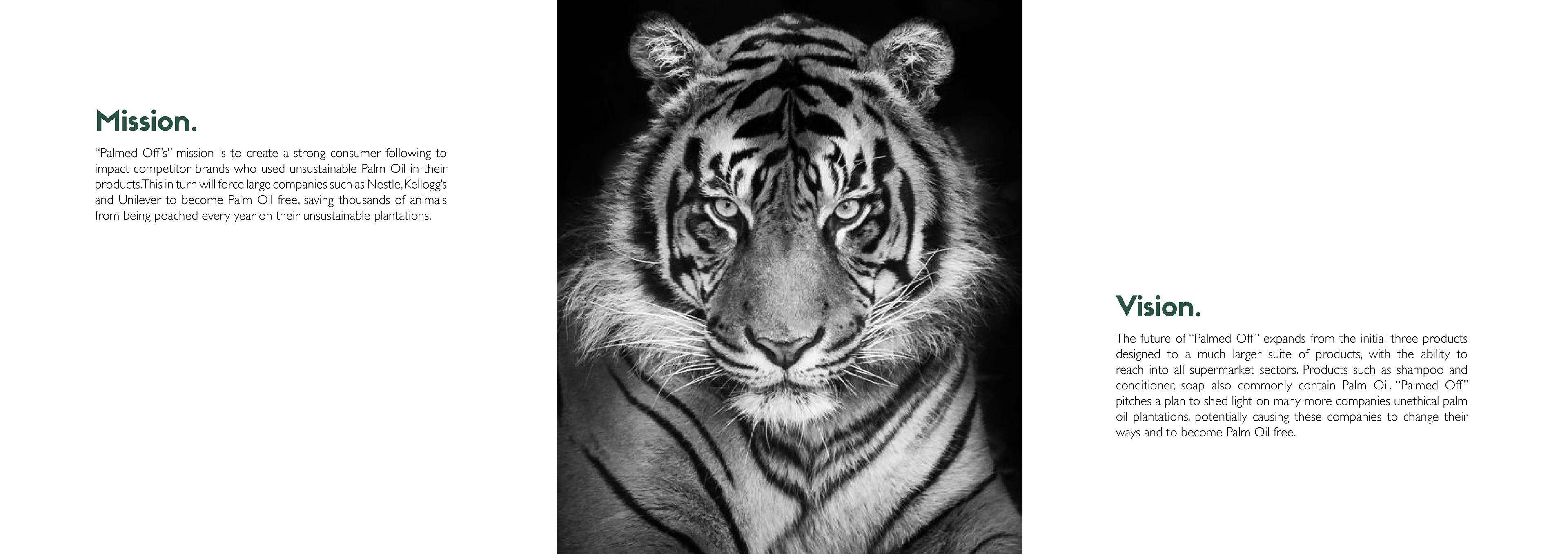
"Palmed Off" is a new supermarket brand which uses package design and advertising to conflict empathy onto potential buyers. The brand is focused on bringing justice for animals who are dying because popular brands source Palm Oil unethically. This means that they are cutting down innocent animals homes, killing off their environment and leaving them in plain sight for hunters to see. Over 50,000 Orangutans alone have been found dead on palm oil plantations due to loss of habitat and deforestation.
Palmed Off's products currently can be found in the form of a chocolate bar critiquing Nestle, and ice-cream critiquing Unilever and cereal critiquing Kellogg's. The brand uses these products to create compelling designs to captivate an audience. These are in the form of package design and and advertising design. Palmed Off's approach is personal and emotive and all designs should quickly captivate the audience, stand out from competitors and in turn convince consumers to purchase the brands palm oil free products.


The Vision for the Brand Mark.
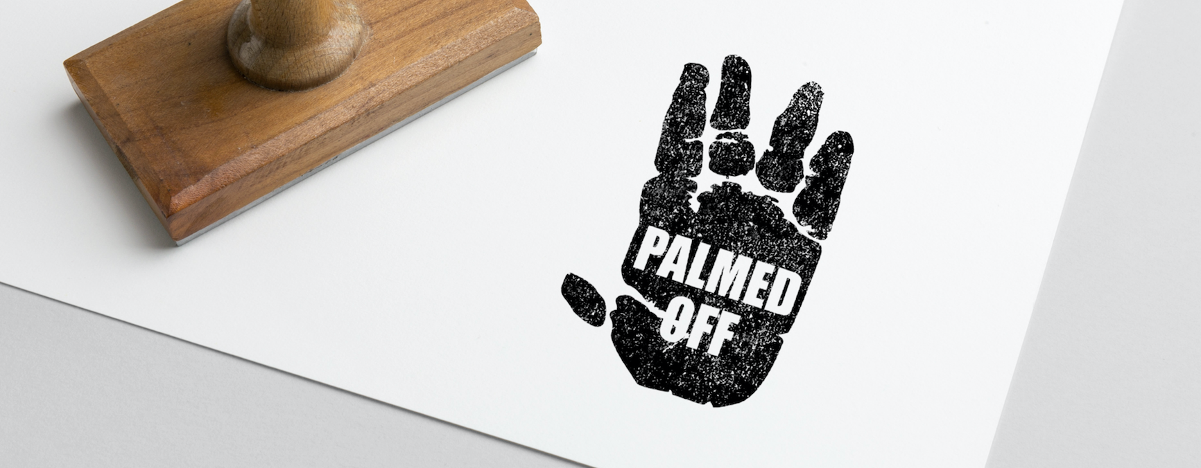
The brand mark chosen to represent Palmed Off needed to represent the brands core values; power, empathy, boldness and change. The brand mark needed to be easily seen when each product is sitting amongst competitors in a supermarket isle. The design needed to be eye-grabbing and instantly informative, ensuring each customers shopping for these products will pick up “Palmed Off” over others and be influenced to turn the packet over and read the story of each animal on the front.
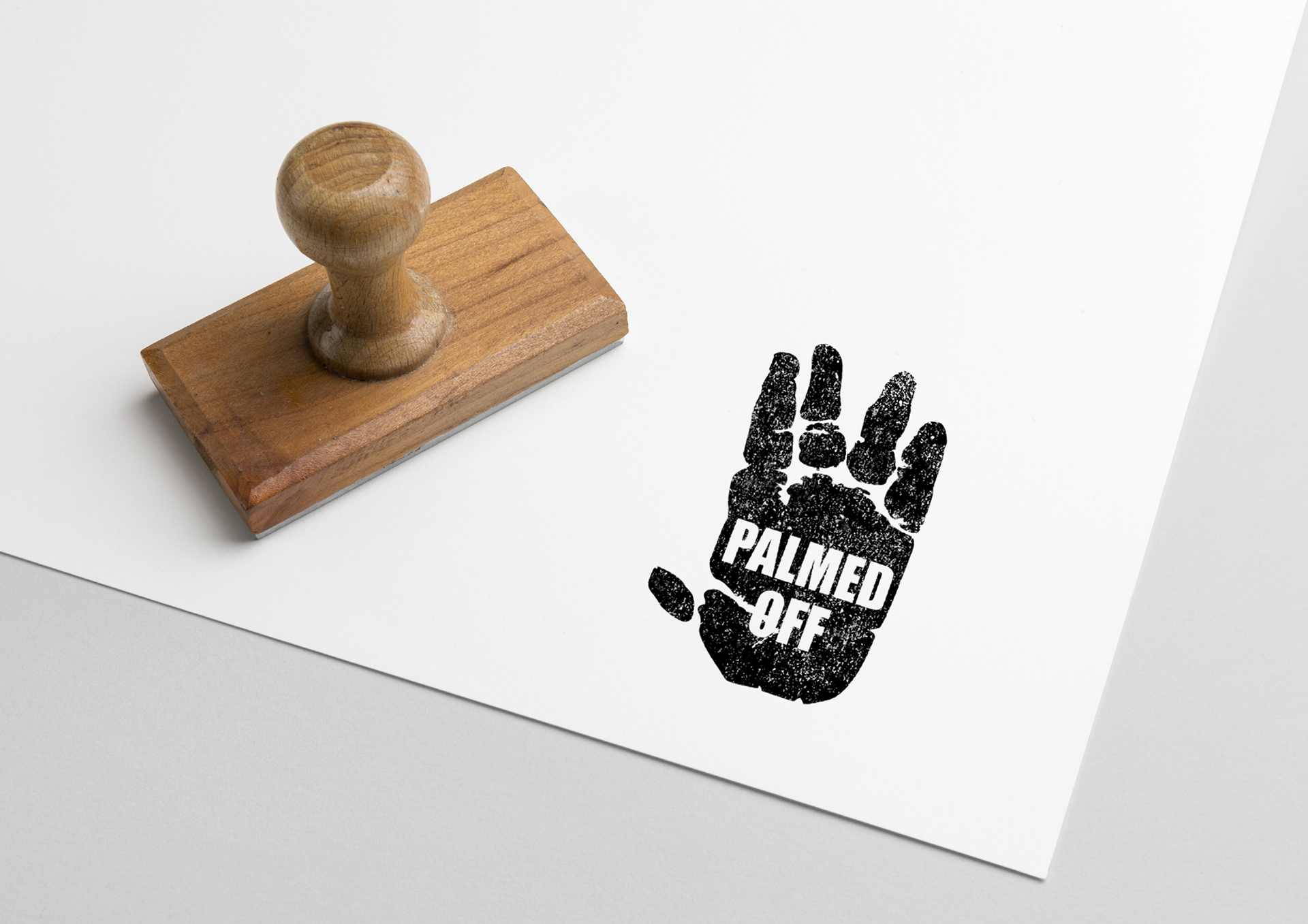
Why was this Brand Mark chosen to represent "Palmed Off?"
Abiding by the guidelines set in place to ensure the brand mark represents the brand, the final design was chosen to include both graphic and typographic elements. As the name of the brand is “Palmed Off”, a design which is inclusive of a palm was chosen to clearly represent the brand. After research on which animal was harmed the most due to palm oil, an Orangutan was decided to represent the face of the brand. To produce the final design an Orangutans palm was traced and vectorized to create a strong eye-grabbing visual point for the brand mark. The name of the brand was chosen to be written in the typeface “Impact” strongly within the negative space of the palm creating a strong centre focus for the design. Overall the brand mark supports a stamp-like feel. Like a top secret stamp which is displayed over important documents, this brand mark offers secret and important information to consumers of companies who are trying to hide their involvement with the Palm Oil industry. These elements come together to create a strong and differentiated visual identifiers for “Palmed Off”.


Cereal Box Design.
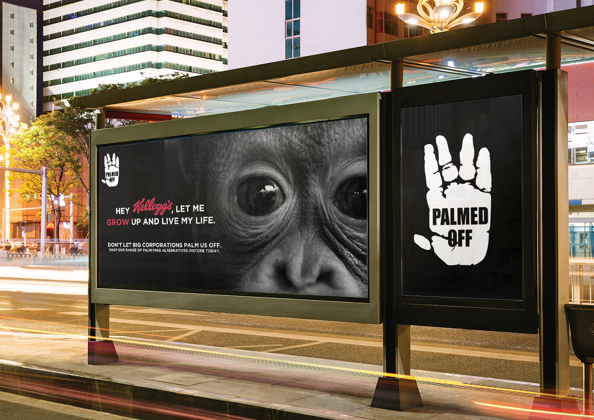
The first of the package design series for “Palmed Off” critiques Kellogg’s use of unethical Palm Oil from their plantations in Malaysia. This has taken form in critiquing Kellogg’s own monkey mascot which lies on the famous CocoPops box. The package design follows the story of a four month old Orangutan named Masie who was found malnourished without her mother. The package is designed to represent a Western missing poster, complete with a photo of Masie and her mother, and her last seen destination.
The package follows the story of Masie with statistics collected of how many Orangutans have been killed on the palm oil plants. After building up empathy for these animals, “Palmed Off” urges the consumer to take the pledge to save other animals lives. The lower half of the packet then talks about the story of “Palmed Off” and what the brand stands for. The package design also includes the brand logo twice with the correct minimum clearance left around the design and highly visible. On the left side of the packet there is the nutrition label and ingredients list for the products of the package.

Ice-Cream Box Design.
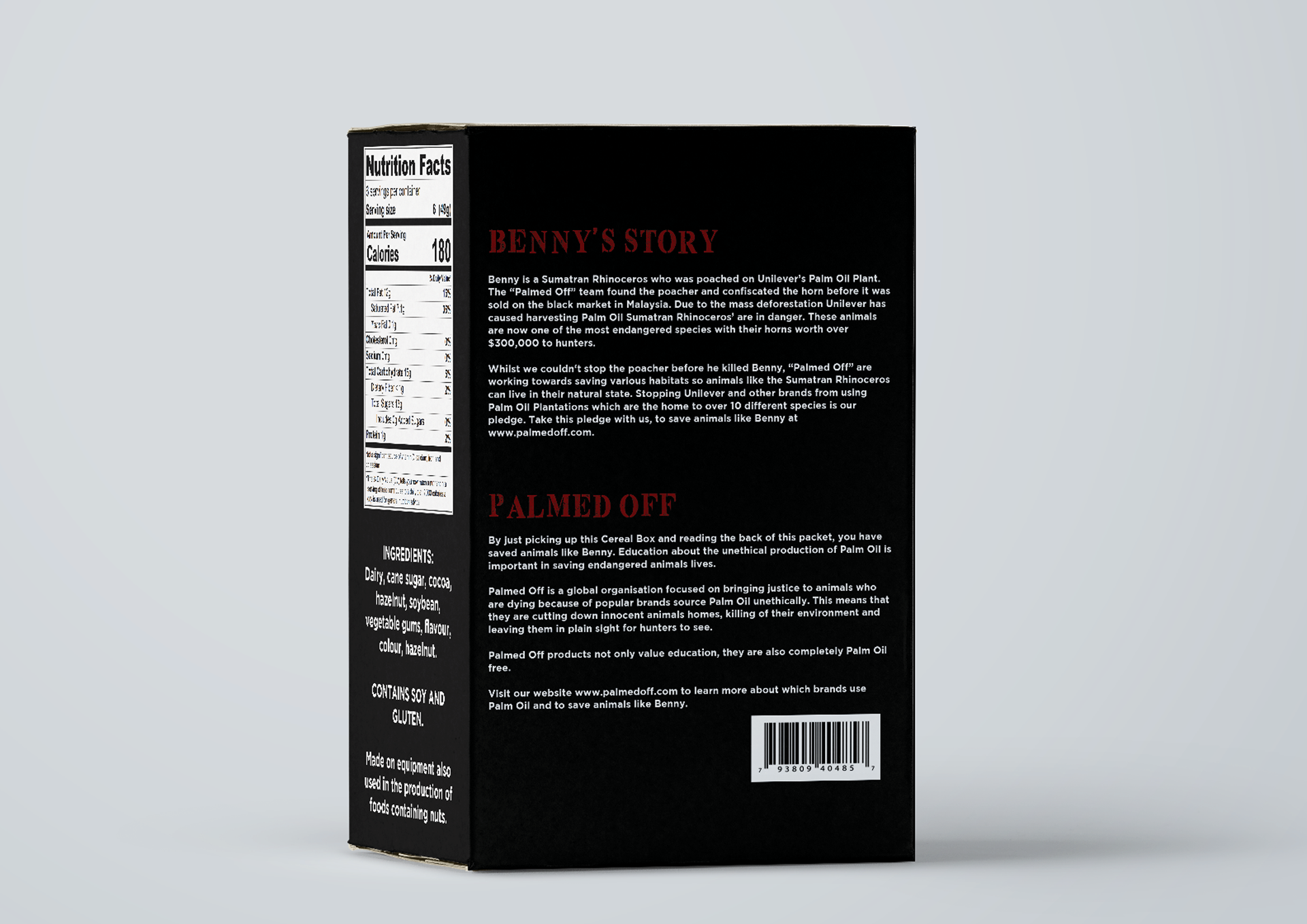
The second package design in the series for “Palmed Off” is an ice-cream box which critiques Magnum’s Classic Chocolate Coated ice-cream. The package design conflicts empathy onto consumers because of the imagery used on the front of the box. This image is of a rhino horn dripping with blood as it has been cut off a rhino who has died on Magnums Palm Oil plantation and stuck on a paddle pop stick like an ice-cream. The back of the package describes that this horn once belong to a Sumatran rhino named “Benny” who was poached on Magnums palm oil plant in Malaysia.
The package creates further empathy for endangered animals stating that Palmed Off couldn’t help “Benny”, but with the consumers help they could help many other animals. The lower half of the packet then talks about the story of “Palmed Off” and what the brand stands for. The package design also includes the brand logo twice with the correct minimum clearance left around the design and highly visible. On the right side of the packet there is the nutrition label and ingredients list for the products of the package.
Chocolate Bar Design.
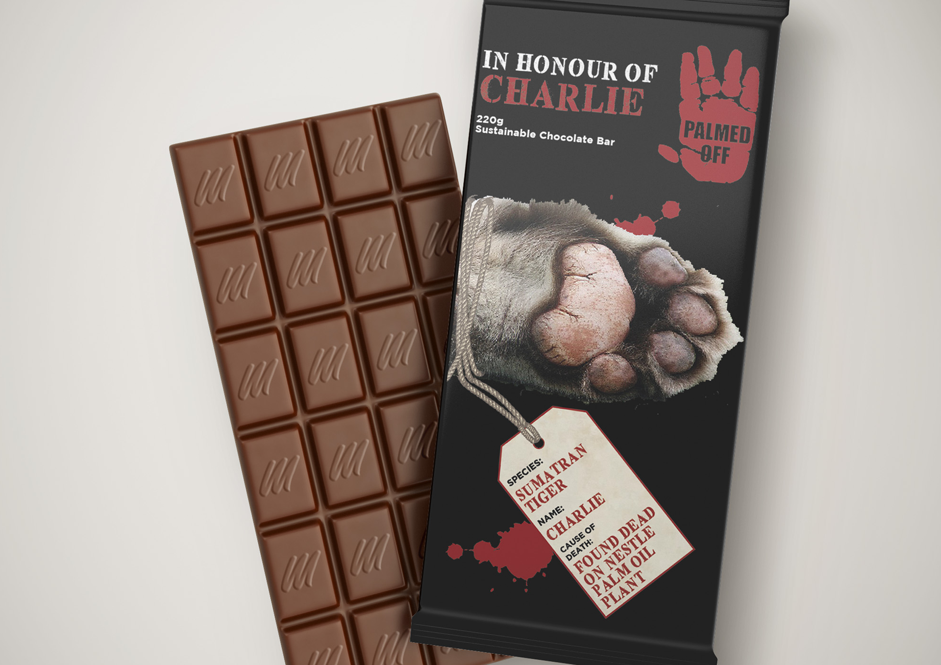
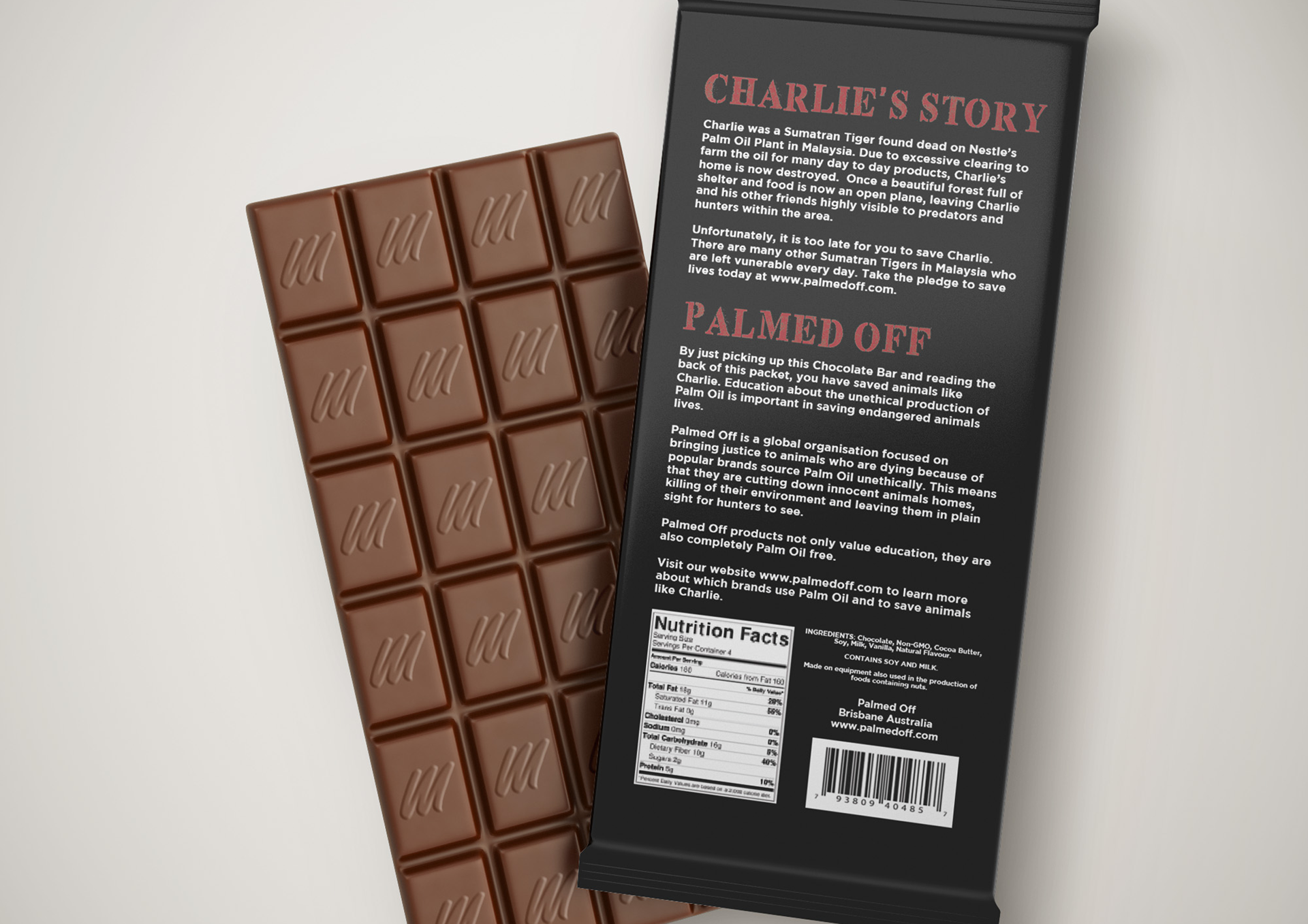
The final package design in the three piece series is a chocolate bar critiquing Nestle’s Palm Oil plantation. The package design follows the story of a Sumatran Tiger named Charlie who was found dead on Nestle’s plant due to deforestation and poachers. The package design creates empathy by displaying “Charlie’s” paw with a specimen tag displaying the name, species and cause of death of the tiger.
After building up empathy for animals like “Charlie”, “Palmed Off” urges the consumer to take the pledge to save other animals lives. The lower half of the packet then talks about the story of “Palmed Off” and what the brand stands for. The package design also includes the brand logo with the correct minimum clearance left around the design and highly visible. On the bottom of the packet there is the nutrition label and ingredients list for the products of the package.